June 14, 2013
Brilliant tag line: Jack's 99c Stores
There is not much to say here other than: Congratulations! To the person who came up with the brilliant tag line for Jack's 99c stores: "Worth every penny." Simple. Clear. Genius.
May 13, 2013
Double NO NO Seven: James Bond Perfume
![]() |
| Single Page Ad in New York Magazine (I believe). |
Saturday morning, a few months ago. Sipping my coffee and enjoying my bagel, I flipped the page in New York magazine and almost choked on the last bite. Having been a huge Bond fan since my early childhood - Dr. No was the first I ever saw; and the images of Ursula Andress collecting sea shells at the beach have stuck with me ever since - I was taken aback by the ad in front of me. I almost dropped my coffee mug as well.
To give you my assessment right away: not only is the ad terrible, but the product is just as awful (note: I am not referring to the scent, but the product idea and the name). But let's do things in order:
PREMISE:
The Bond franchise has been cultivated for decades and has created a rare cinematic phenomenon, that - if managed the right way - can provide for all of the Albert Broccoli's descendants for decades to come. There have been mistakes, bad choices in actors (George Lazenby or Timothy Dalton), there have been good Bonds and bad Bonds, good product integration (Aston Martin) and bad product placement (Ford Fiesta), but overall the Bond brand is pretty clearly defined, at least in my mind. It is (in random order): classy, sophisticated, elegant, smart, intelligent, exciting, dangerous... you'll get the idea. So everything you roll out with the 007 / James Bond name attached to it should look or feel the same way, no? Let's take a look at both the ad, and the idea.
THE PRINT AD
Other than the tag line "Dangerously Sophisticated", nothing in this ad is. Neither dangerous. Nor sophisticated. This is one of the cheapest advertising executions I have ever come across in my entire career. Why? Here are a few reasons why:
A) Where is Bond? Was Daniel Craig too expensive? Was he perhaps not convinced that this perfume roll-out was a good idea? Or does he have a non-compete agreement in place for another fragrance he is endorsing? So instead of actually showing Bond, they give us... a nobody without a face. WTF?! It is not only cheap, since you don't have to pay this actor / model guy much money as his face is not recognizable, but it is also bad, because everyone and their brother can tell that this guy is not Bond, but an impostor.
B) The Setting / Background. There is none. They put him against a white background, with a graphic element of the barrel of a gun. Again: wtf?! This should have been shot with Bond sitting at the bar at the Macao hotel in Skyfall and his female counterpart in her seductive dress next to him. Or Bond walking into the casino, a scene so strong and powerful, it carries the quintessential Bond DNA in one image (see bottom of this post). That scene alone evokes a million emotions. The one above does not.
C) The watch. Look it up. A gentleman does not wear a tuxedo with a chronograph with a metal wrist band. Never. Ever.
D) The product name. There is none! They just call it '007'. Either they were lazy, or they were bad executioners of the idea, this product needs a name. One such as 'CONVICTION' or 'CREED' or the like.
So far for the ad. I seriously can't find one good thing about it. It certainly does not make me even want to try to smell it.
THE IDEA
If I were to roll out an idea about a 007 perfume, the first question I'd ask myself is: which perfume would James Bond actually wear? Armani? Versace? Tom Ford? Gucci? Prada? That's where I would start. That is what I would define as the bench mark. Scent, bottle design, advertising - it all has to be up to par. Nothing less. Just look at the design of the bottle: it is just so... cheap... and the opposite of what Bond stands for.
Going even back one step, before executing the idea I would ask myself: is this actually a good idea? If not sure, I would test it among consumers. I am sure James Bond has done a lot for Omega Watches. But would it have worked for '007 Watches'? Probably not. Successful merchandising has to be planned by smart people making smart decisions. This concept to me seems half-baked, ill-fated, and looks / feels like a cheap copy made overseas sold to me on Canal Street in Chinatown, not like official 007 merchandise. I am sure that is not what the people at Danjac, LLC, the official holding company for copyright and trademarks of all Bond related elements had in mind.
MAD SCORE: -4
Message: -1, there is none other than the boring 'The new fragrance for men'.Creative: -1, poor idea, badly executed
Context: -1, not at all aligned with the movie launch of Skyfall
Impact: 0, because Michael "The Situation" Sorrentino from the Jersey Shore cast might actually buy a bottle
Intangibles: -1, there are none, which is very sad
How about this image instead for an alternate ad? Imagine the bottle and the logo in the lower right corner. Done.
May 10, 2013
Incredibly bad: Microsoft Surface Outdoor Mural
![]() |
| Downtown Manhattan. On West Houston Street. |
These painted outdoor murals have been the latest hot thing to do in outdoor advertising for the last two years. In Hipster Brooklyn Williamsburg they are everywhere: Vans, Converse, Levi's etc. The approach is pretty clear: by doing something unusual, something different you are positioning your brand as unusual / different / off mainstream.
But Microsoft? I can't stop laughing. The brand is so mainstream commercial, mass market, that this ill-fated attempt can only be described as laughable. Bad enough that Microsoft tries to position the Surface as cool, and hip, and energetic, and awesome, and god knows what - those TV commercials with all the people dancing and clapping and flipping and shaking are still causing seizures just by thinking of it - but an outdoor mural? What half-brained media planner / marketing manager signed off on this?
Sure thing, Microsoft's advertising dollars are plenty and in the multi millions, and a miss like this sure won't hurt them and is merely a drop in the bucket of what they spend, but I doubt that the advertising effectiveness of this mural is anywhere else but ZERO. Why? Here are the reasons:
A) The New York downtown crowd is very much anti main stream. They barely venture across 14th Street. And do you know where they hang out? Exactly, at the Apple Store. They wouldn't touch a Surface with a pair of pliers.
B) That leaves the tourists as the audience. Be assured most of them are not from New York, and can probably be targeted via traditional advertising. A more mainstream billboard on Times Square will be so much more effective getting to them. Plus, Times Square is where all of them go. Houston Street will get you a fraction.
C) The creative execution. Don't even get me started. This is so awfully bad and poorly done. What is the point of this mural? A six year old child can draw a better tablet / computer / laptop. This does absolutely nothing. I don't even know what the message is here. It would at least have been a fraction of cool if they had left the damn 'Microsoft' logo off, so people will ask themselves 'What is Surface'? and might go home and google it. But this? I can't stop laughing. Someone should get fired for this.
MAD SCORE: -5
Message: -1, there just is none
Creative: -1, a toddler can do better
Context: -1, just wrong
Impact: -1, impact is zero, trust me
Intangibles: -1, there are none
September 28, 2012
Don't mess with your brand: Goldenberg's Peanut Chew
![]() |
| The original packaging |
![]() |
| Then some idiot decided to do this. Sales tanked. |
![]() |
| Now Goldenberg's is almost back to its original. |
One would think that as business professionals we learn from others mistakes, gain experience, get better, and avoid certain traps. Yet a story like the one of Goldenberg's Peanut Chews is only one in a long chain of fundamental fuck-ups in corporate America, where some moron decides to go against the fundamentals of marketing knowledge.
Remember the packaging redesign disaster around Tropicana Orange Juice? Or the GAP New Logo mess? Or the classic Coke / New Coke mess? Well, here is another one. Thank God someone at Goldberg's Peanut Chewing headquarter put an end to it, did some research and reverted back to where the brand was before, most importantly put the 'Goldenberg's' name back on the packaging that tells people that this is what they're looking for.
Lesson learned: Don't mess with your brand. If you're the CEO: don't let some self-proclaimed marketing specialist just go ahead and change the packaging. If you're the Marketing Manager: Don't let some agency honcho talk you into a need for a redesign - they are an agency and want you to give them money so they can keep designing. In a nutshell: All the people who were responsible for this almost disaster should have gotten fired. They have no business being in their business. End of story.
Read the whole story at nytimes.com:
After Failed Identity Change, Peanut Chews Reclaims Its Goldenberg’s Roots
September 27, 2012
All-time Classic: Audi's 'Vorsprung durch Technik' Ad Slogan
Vorsprung durch Technik – ad slogan that changed how we saw Germany
September 26, 2012
Bad Product Naming: 'Fungus Among Us'
Some things are just too good to be true. Like the above brand discovered on a recent trip to the local Gristedes Grocery store chain here in New York. It's pretty clear that what they are selling are mushrooms of various sorts, but calling it 'Fungus'? Just for the sake of having a funny sounding brand name? Who calls their brand 'Fungus Among Us'? Seriously? Last thing I remember that lived in the perceived world of above mentioned brand name was my house guest's miniature spray bottle to cure some kind of 'fungal infection'. Pretty damn sure as hell that I will not touch anything named 'Fungus'. Here a picture of his cure:
August 23, 2012
Olympic Gold II: Nike Follow Up
![]() |
| At the corner of 34th Street & 7th Avenue. |
Just yesterday I noticed this billboard in Manhattan around Penn Station. What a brilliant follow up to their already brilliant commercial. They took the best scene of the commercial, blew it up on a 50 ft high poster, and put it in one of the busiest street corners of Manhattan. Another: +5
Olympic Gold for Nike: Find your greatness
The Olympics are over, and even though Nike wasn't one of the exclusive sponsors, they truly scored themselves a gold medal with their campaign. Remember: Anyone who doesn't fork over top dollar to the IOC, is not allowed to make any references to the '2012 Olympics' whatsoever. No mention in the copy. No showing the Olympic rings. Nothing. Nada. Niente.
So what did Nike do? They set it up with a series of 'London' signs that brilliantly gets Nike a free ride on top of all of what the Olympics are all about. I honestly don't remember anything Adidas - the official sponsor - did during the Olympics. Hence, Gold medal for Nike. And Wieden + Kennedy for making it such a wonderful commercial.
My favorite scene: The last scene, when the little boy runs his hand through his hair, and then... jumps! (0:55).
MAD SCORE: +5
Message: +1, no explanation necessary
Creative: +1, brilliant execution
Context: +1, can it get better than this?
Impact: +1, I'm pretty sure this was a home run
Intangibles: +1, because of its absolutely brilliant strategy
March 2, 2012
Banksy on Advertising
Apparently, this piece was written by Banksy:
“People are taking the piss out of you everyday. They butt into your life, take a cheap shot at you and then disappear. They leer at you from tall buildings and make you feel small. They make flippant comments from buses that imply you’re not sexy enough and that all the fun is happening somewhere else. They are on TV making your girlfriend feel inadequate. They have access to the most sophisticated technology the world has ever seen and they bully you with it. They are ‘The Advertisers’ and they are laughing at you.
You, however, are forbidden to touch them. Trademarks, intellectual property rights and copyright law mean advertisers can say what they like wherever they like with total impunity.
Fuck that. Any advert in a public space that gives you no choice whether you see it or not is yours. It’s yours to take, re-arrange and re-use. You can do whatever you like with it. Asking for permission is like asking to keep a rock someone just threw at your head.
You owe the companies nothing. Less than nothing, you especially don’t owe them any courtesy. They owe you. They have re-arranged the world to put themselves in front of you. They never asked for your permission, don’t even start asking for theirs.”
While often, I am quite annoyed myself with certain aspects of the industry I am working in, I have to disagree with Banksy on many levels. Most of the time, his work is brilliant, has depth, and makes people think. The argumentation in his letter however is beyond superficial, aims to grab attention in a cheap way, and is to a large extent extremely hypocritical.
I was going to write my own analysis here, but Craig Ward has already done an eloquent and coherent piece in his brilliant blog post.
Related links:
Craig Ward's blog: The Words are Pictures
“People are taking the piss out of you everyday. They butt into your life, take a cheap shot at you and then disappear. They leer at you from tall buildings and make you feel small. They make flippant comments from buses that imply you’re not sexy enough and that all the fun is happening somewhere else. They are on TV making your girlfriend feel inadequate. They have access to the most sophisticated technology the world has ever seen and they bully you with it. They are ‘The Advertisers’ and they are laughing at you.
You, however, are forbidden to touch them. Trademarks, intellectual property rights and copyright law mean advertisers can say what they like wherever they like with total impunity.
Fuck that. Any advert in a public space that gives you no choice whether you see it or not is yours. It’s yours to take, re-arrange and re-use. You can do whatever you like with it. Asking for permission is like asking to keep a rock someone just threw at your head.
You owe the companies nothing. Less than nothing, you especially don’t owe them any courtesy. They owe you. They have re-arranged the world to put themselves in front of you. They never asked for your permission, don’t even start asking for theirs.”
While often, I am quite annoyed myself with certain aspects of the industry I am working in, I have to disagree with Banksy on many levels. Most of the time, his work is brilliant, has depth, and makes people think. The argumentation in his letter however is beyond superficial, aims to grab attention in a cheap way, and is to a large extent extremely hypocritical.
I was going to write my own analysis here, but Craig Ward has already done an eloquent and coherent piece in his brilliant blog post.
Related links:
Craig Ward's blog: The Words are Pictures
February 20, 2012
Case Study: How to fuck up a brand - Aston Martin
I am making a bold prediction here: Aston Martin is going down. Not overnight, but it will die a slow and steady death. Why? Take a look at Exhibit A) and Exhibit B). Then pause for a moment and ask yourself: What is wrong with this picture? Trust me, you don't have to be an Einstein to figure this one out.
EXHIBIT A:
Now take a closer look at this:
EXHIBIT B:
Notice the difference? Exhibit A is part of what I refer to as Aston Martin's "Brand Equity Portfolio (BEP)" BEFORE and Exhibit B is part of the BEP AFTER 'The Cygnet'.
Aston Martin introduced this abomination in June 2009, apparently due to some emission law guidelines bla bla bla... basically to have one car in their portfolio that is eco-friendly to help save the planet etc.p.p. Got the message. Thank you. Well, we all understand that the world needs alternative resources, renewable energy, eco friendly transportation alternatives etc.. It's pretty much a no-brainer.
What we don't understand - or I in particular - is how the people at Aston Martin could make such a horrendous mistake in mismanaging their brand portfolio. Adding a pimped up Toyota IQ to the Aston Martin family and slapping an Aston Martin badge on it, simply to satisfy law makers? Really? Couldn't think of a better solution? Couldn't take a look at history and the competition and learn from other car makers' mistakes?
Volkswagen (VW) learned the hard way when it finally had to put an end to its CEO's passion project - the VW Phaeton. Volkswagen (translated: the people's car) sold 1,433 units in 2004 and only 820 in 2005 in the U.S. What was the problem? Well, 'the people's car' had tried to enter a segment where people don't drive 'the people's car' any longer, but spend a whole lot of extra money for 'luxury cars', such as the Mercedes S-Class, the BMW 7 series or the Audi A8. Why would you spend the same amount of money for a VW if you can drive a Mercedes?
Lesson learned: know your brand's sweet spot. The zone you are successful in. The range you can rationally and emotionally justify towards your audience and consumers. How far can you successfully 'stretch' your brand?
Aston Martin has been trying to go the opposite way, by going small. Law and business decisions aside, this was a stupid move from a Brand Management perspective. Why?
ONE - BRAND EQUITY
By having introduced this fugly piece, Aston has forever changed its carefully built and composed Brand Equity. Just take a look at the long history of Aston Martins (Wikipedia link below). There has been such a consistent story over all these years that is almost second to none.
TWO - TOYOTA IQ & CYGNET
Many car makers do it: badge engineering - taking one platform, and use it to build multiple vehicles on top of it. Quite often they get away with it, because the brands are low profile and the cars live in the 'use' vs. 'want' category. But taking a Toyota IQ, and trying to sell it as an Aston Martin? Really? That's messed up. I have no respect for anyone who allows themselves to be fooled by it. Just look at it:
THREE - JAMES BOND
Now you might laugh about this, but trust me. Ask a hundred guys on the street what they associate with Aston Martin, and I bet you a hundred dollars "James Bond" will be one of the 10 attributes you will hear most often. You can safely add him to the Brand Equity Portfolio. Now do me one favor: imagine him in a Cygnet. Do I have to explain this any further?
FOUR - THE NAME
"Cygnet" - what? What a fun exercise it would be to do a reverse associations test to see what comes to mind. Here are my attributes: cyborg / androids / terminator / computer / spy wars ... geez... what the hell were they thinking?
How does something like this come to live? Who makes these decisions? Who are the people behind these fuck-ups? I don't know. I can only guess. Here is what I think: It all comes down to either non-existing brand management, incompetent brand management, delirious brand management, or management dictating brand management (as was the case with VW's Ferdinand Piech - who's quite a brilliant business person, but he got the Phaeton completely wrong).
As was the case with Aston Martin, the brand was sold off in 2007 by Ford to a joint venture company for 479m GBP (for more see Wikipedia link). New ownership, new management, new marketing, new egos... everyone wants to leave their mark. Bang. There you have it.
THE BETTER ALTERNATIVE
Simple. Super simple. Set up an 'Aston Martin Holdings' company, which houses the 'Aston Martin' luxury sports car brand, and the newly created 'Cygnet' luxury mini cars brand. Aston Martin remains what it always has been. Its Brand Equity Portfolio remains intact. And the new Cygnet brand kicks off with the Cygnet C1, followed by the Cygnet C2, C3 etc., predominantly focusing on highly populated urban areas such as Singapore, Hong Kong, New York etc. Done. No harm. No foul. Everybody happy.
Whatever happened at Aston Martin, it will go down in Marketing textbook that haven't even been written yet as one of the major brand fuck up stories of the 21st Century. And it pains me to witness the demise of one of my favorite car brands of all times.
Related links:
Aston Martin's website
Aston Martin on Wikipedia
Volkswagen's Phaeton Story
EXHIBIT A:
![]() |
| 1 - Aston Martin DB5 |
![]() |
| 2 - Aston Martin Vantage |
![]() |
| 3 - Aston Martin One-77 |
Now take a closer look at this:
EXHIBIT B:
![]() |
| 1 - Aston Martin DB5 |
![]() |
| 2 - Aston Martin Vantage |
![]() |
| 3 - Aston Martin Cygnet |
Notice the difference? Exhibit A is part of what I refer to as Aston Martin's "Brand Equity Portfolio (BEP)" BEFORE and Exhibit B is part of the BEP AFTER 'The Cygnet'.
Aston Martin introduced this abomination in June 2009, apparently due to some emission law guidelines bla bla bla... basically to have one car in their portfolio that is eco-friendly to help save the planet etc.p.p. Got the message. Thank you. Well, we all understand that the world needs alternative resources, renewable energy, eco friendly transportation alternatives etc.. It's pretty much a no-brainer.
What we don't understand - or I in particular - is how the people at Aston Martin could make such a horrendous mistake in mismanaging their brand portfolio. Adding a pimped up Toyota IQ to the Aston Martin family and slapping an Aston Martin badge on it, simply to satisfy law makers? Really? Couldn't think of a better solution? Couldn't take a look at history and the competition and learn from other car makers' mistakes?
Volkswagen (VW) learned the hard way when it finally had to put an end to its CEO's passion project - the VW Phaeton. Volkswagen (translated: the people's car) sold 1,433 units in 2004 and only 820 in 2005 in the U.S. What was the problem? Well, 'the people's car' had tried to enter a segment where people don't drive 'the people's car' any longer, but spend a whole lot of extra money for 'luxury cars', such as the Mercedes S-Class, the BMW 7 series or the Audi A8. Why would you spend the same amount of money for a VW if you can drive a Mercedes?
Lesson learned: know your brand's sweet spot. The zone you are successful in. The range you can rationally and emotionally justify towards your audience and consumers. How far can you successfully 'stretch' your brand?
Aston Martin has been trying to go the opposite way, by going small. Law and business decisions aside, this was a stupid move from a Brand Management perspective. Why?
ONE - BRAND EQUITY
By having introduced this fugly piece, Aston has forever changed its carefully built and composed Brand Equity. Just take a look at the long history of Aston Martins (Wikipedia link below). There has been such a consistent story over all these years that is almost second to none.
TWO - TOYOTA IQ & CYGNET
Many car makers do it: badge engineering - taking one platform, and use it to build multiple vehicles on top of it. Quite often they get away with it, because the brands are low profile and the cars live in the 'use' vs. 'want' category. But taking a Toyota IQ, and trying to sell it as an Aston Martin? Really? That's messed up. I have no respect for anyone who allows themselves to be fooled by it. Just look at it:
![]() |
| Price tag: 25,000 Euro - 30,000 Euro ($35,000 - $42,000) |
![]() |
| As compared to: 13,000 Euro - 17,000 Euro ($18,000 - $24,000) |
THREE - JAMES BOND
Now you might laugh about this, but trust me. Ask a hundred guys on the street what they associate with Aston Martin, and I bet you a hundred dollars "James Bond" will be one of the 10 attributes you will hear most often. You can safely add him to the Brand Equity Portfolio. Now do me one favor: imagine him in a Cygnet. Do I have to explain this any further?
FOUR - THE NAME
"Cygnet" - what? What a fun exercise it would be to do a reverse associations test to see what comes to mind. Here are my attributes: cyborg / androids / terminator / computer / spy wars ... geez... what the hell were they thinking?
How does something like this come to live? Who makes these decisions? Who are the people behind these fuck-ups? I don't know. I can only guess. Here is what I think: It all comes down to either non-existing brand management, incompetent brand management, delirious brand management, or management dictating brand management (as was the case with VW's Ferdinand Piech - who's quite a brilliant business person, but he got the Phaeton completely wrong).
As was the case with Aston Martin, the brand was sold off in 2007 by Ford to a joint venture company for 479m GBP (for more see Wikipedia link). New ownership, new management, new marketing, new egos... everyone wants to leave their mark. Bang. There you have it.
THE BETTER ALTERNATIVE
Simple. Super simple. Set up an 'Aston Martin Holdings' company, which houses the 'Aston Martin' luxury sports car brand, and the newly created 'Cygnet' luxury mini cars brand. Aston Martin remains what it always has been. Its Brand Equity Portfolio remains intact. And the new Cygnet brand kicks off with the Cygnet C1, followed by the Cygnet C2, C3 etc., predominantly focusing on highly populated urban areas such as Singapore, Hong Kong, New York etc. Done. No harm. No foul. Everybody happy.
Whatever happened at Aston Martin, it will go down in Marketing textbook that haven't even been written yet as one of the major brand fuck up stories of the 21st Century. And it pains me to witness the demise of one of my favorite car brands of all times.
Related links:
Aston Martin's website
Aston Martin on Wikipedia
Volkswagen's Phaeton Story
January 22, 2012
Love: Logo Design
Some logo designs are just ... I am at a lack for words here. 'Love' seems to be the most fitting. How brilliant is that? Wouldn't you wanna eat there?
January 21, 2012
Fantastic: 2012 Volkswagen Game Day Commercial Teaser
Can't wait for the Superbowl commercials this year. After last year's somewhat mediocre creative executions, it can only get better. Volkswagen's "The Bark Side" is a fantastic appetizer. Fingers crossed.
August 30, 2011
Unexpected & fun: Lanvin's campaign video
Who would have thought a high-end fashion brand could, or would I should say, break an ad campaign with such a fun video? Almost no one I'd assume. When it comes to fashion brands, we are so used to see uber-sexy goddesses in surreal poses, often with an alien-like quality, remote, distant from the world we live in.
Kudos to 'House + Holme', who created this fun video. And applause to the marketing folks at Lanvin for signing off on the concept. The result: something uniquely fresh and unexpected. I watched this a couple of times, and it put a smile on my face every time. I'm not in the market for Lanvin, and I'm sure many others aren't either, but if this gets through to me, assume how many others there will be?
MAD SCORE: +4
Message: 0, there's never really a message with fashion brands
Creative: +1, because it's a fun concept
Context: +1, it works well in the social space
Impact: +1, I'm sure this helps selling some clothes
Intangibles: +1, because of its uniqueness
August 9, 2011
Unique: Chevy Dream / Chevy Runs Deep
We are being bombarded every day with commercials for cars that no one needs or wants. Yet still, people keep buying them for some reason.
I bet you there are quite a few guys out there who will buy this baby - the Chevy Camaro. Not just because of the advertising (without a great product, the commercial does nothing), but because the essence of the product is perfectly being interpreted in this commercial, telling a simple, yet powerful story we all can relate to.
Check out the dog when it climbs up the bottom of the bed. And the engine sounds at 0:53! Absolutely love it.
MAD SCORE: +4
Because everything works here. Only issue I have is that the world doesn't need another gas guzzler, but eco-friendly solutions.
Related links:
2011 Chevy Camaro Superbowl Commercial
August 5, 2011
Finally - the video of McD's super-annoying 'Sweat-tea-pie commercial'
I ripped this one back in May (see link below), but I simply cannot let it go. It's just so goddamn awful. The more I see it on air, the more it makes me actually not just dislike the golden arches, but hate McDonalds. BIG TIME.
It took a while to find the video online. Seems that someone from McD or the ad agency actually had the brains not to upload a hi-res version, but thanks to someone with an Android phone, the above ended up on YouTube.
I googled around a little bit, and the responses this video gets are actually all pretty BAD, which makes me wonder why no one at McD has pulled this freaking mess off the air.
Here are a few unfiltered comments:
From Shaggybevo:
"As if McDonald's couldn't out-retard themselves anymore than they already have... Goddammit mcDonald's, stop making me want to murder people."
"... you do have to admit that the ad wizards behind this one have successfully communicated one thing: People who eat at McDonald's are morons."
"The level of stupidity is unconscionable."
"...glad i'm not alone in my hatred of this ad."
"The sad thing is someone got paid to create this ad and then someone else decided it was acceptable."
Enough said. Just makes me wonder what kind of marketing genius works in the marketing department at McD, and what kind of creative genius cooked up this freaking mess. They all deserve to be fired. Goddamnit.
Related links:
Original post 3/3: 'So annoying - the latest McDonalds commercial'
Another nice point of view at Prolifically Ridiculous
Shaggybevo discussion board
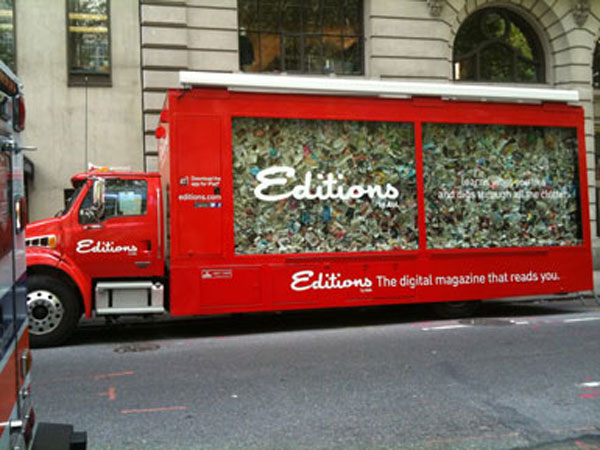
A Winner: AOL's 'Editions' Truck
![]() |
| Bryant Park. Southside. |
![]() |
| iPad stations & lovely, friendly promotional staff. |
![]() |
| Well designed. Flawless presentation. |
As I was strolling through the streets of Manhattan on this wonderful August summer day - the first one with California weather: 72 and sunny - my always wandering eyes were captivated by a very well executed promotional event, this one done by AOL.
In an earlier blog criticizing the makers of the reality TV show 'Swam People' for trying to score with a cheap publicity stunt (link see below), I wrote about the challenge of getting people's attention in New York City, where everyone and their brother are trying to get you to listen.
AOL did manage to do just that. And they almost got me to order an iPad online, because this editions app is actually quite cool. As I sat down on one of these chairs and played around with one of the iPads, a friendly, young lady came over and guided me through the program. She was well trained and very knowledgeable, although her eyes, at every question I asked, seemed to be trying to locate an invisible teleprompter hidden behind my left shoulder.
Editions, in a nutshell, is an app that pulls news content from various sources from the web and hence puts together your very own customized newspaper, similar to the social networking news aggregation app flipboard. It is pretty sweet. The only shortcoming is that you cannot print an article. Saving, archiving, and later printing are still quite somewhat essential for a writer. But perhaps I'm already part of a dying species.
In any case. AOL stopped me on a busy Manhattan work day, and got ten minutes of my attention. And hey, their promotional tour bus even inspired me to write about it. That is quite an accomplishment.
MAD SCORE: +5
Message: +1, because the iPad sells like hot cakes, and this app is pretty cool
Creative: +1, that is one impressive truck, and it's very well put together
Context: +1, because they understood that content is king, the medium (paper) only, well, the medium
Impact: +1, I predict this to be a success
Intangibles: +1, add the pretty ladies, and the 360-impeccably presented promotional stations, and AOL has got itself a winner
Related links:
For more about AOL's 'Editions' click here
Blog post 3/31: 'Cheap public stunt - Swamp people's fake gator'
More about 'Mad Ad Scores'
July 26, 2011
A wasted effort: John Hancock Financial Services
While traveling Europe a few years ago, I came across various kinds of markets, e.g. in Amsterdam it was a ginormous flower market, and in Hamburg quite a unique fish market. Both markets had one thing in common. Pretty much all the vendors offered the same thing: in Amsterdam flowers, in Hamburg fish.
Now who do you think sold the most flowers, or fish respectively? The silent vendors with the most subtle appearance, flying under the radar, trying to be smart? Or the ones that were screaming one witty punch line after another into the audience?
I can't really say that the dear folks at Hill Holliday, the advertising agency in Boston, who are responsible for this disaster, don't get advertising, and are a sub-par shop. Quite the opposite. Their latest work for Dunkin' Donuts actually earns a +5 on the Mad Ad Score scale. But their team working on its John Hancock account simply seemed to have gotten lost in a bad idea.
Why is this so bad? Well, let's go back to basics.
The TV audience doesn't watch TV to seek out witty commercials. They don't really watch the commercials. Commercials are a nuisance, white noise, thrown at you by the networks. No one asked for them. No one, except a few mad people like me, actually pay attention.
Hence, you cannot assume that the audience, in between Yankees innings, or the latest C.S.I. episode, are desperately waiting to read typed text on their TV screen that tries to sell them on financial products. Granted, the messages are relevant, and investing for one's retirement is a serious subject matter and shouldn't be left to chance.
But, please! Not making use of the audio component? WTF? Were the minds at Hill Holliday actually on holiday? Or were they just too much in love with their idea? Back to advertising 101: with a TV commercial you get:
a) :30 sec of moving images to tell a story, and
b) a radio commercial on top of it.
Still don't get it? OK, let's take the behavioral approach. Taking into consideration the behavior described above, it's pretty much safe to assume that most folks watching TV, while on commercial break, either:
- go to the bathroom
- check their iPhone, bberry
- grab their iPad, Laptop
- snack on some popcorn, get a drink
- read the mail, a newspaper clip
- ... you fill in the blanks here
The one thing most of them don't do is: watch! Yet still, they do have ears, and if they don't mute the TV, they still will - to some degree - be able to listen to your message.
If you do what HH did for John Hancock above (and there is a bunch of other very bad examples online, see link below), you are wasting pretty much half of your media buy on the home-TV-watching audience. Whoever is out at a bar won't be able to listen anyway.
MAD SCORE: -2
Message: 0, because no one is reading it
Creative: 0, it's boring
Context: 0, you got in front of me, but you didn't get through to me
Impact: -1, it's all together a wasted effort
Intangibles: -1, this has got nothing special to it
Related links:
More examples on Hill Holiday's agency website
More about Mad Ad Scores
July 25, 2011
Disastrous: Rihanna & Vita Coco Water
I have been in this industry for many years, and if there is one truth that has solidified itself over the years, it is that most of the advertising involving celebrities is poorly done.
And now they present to us: Rihanna & Vita Coco Water. Oh my... Not that the combination of the two is bad right from the start. No, not at all. But whoever executed this - both strategically and creatively - needs to be fired. Seriously. Why? Well, here is why:
ONE: THE MESSAGE
"Hydrate Naturally. From a tree, not a lab." Visual: Rihanna with RED, dyed hair. The color in her hair is clearly from a lab. It's beyond me that no one on the creative team got the irony of it.
TWO: THE IMAGE
Besides the fact that there is nothing natural about dyed, red hair, let's focus on the image. Rihanna is a beautiful, energetic person. That's how we know her. Yet whoever took this image managed to turn her into an apathetic, emotionless, neutral human something, void of any expression. What a disaster!
THREE: THE CAPTION
Whenever you have to tell the audience that the celebrity you are showing them is the celebrity you are showing them, in this case in UPPERCASE letters right next to her face, then you are doing it for a reason, right? Someone must have figured out that some people may not recognize Rihanna in the picture, which raises the question: if so, why choose her in the first place?
Michael Jordan never needed a caption of his name on anything bearing his image. Neither did Kobe, LeBron, or Michael Jackson. Yet according to Matt Delzell, an account director in the celebrity entertainment division of The Marketing Arm, the Omnicom agency who cooked up this dish: "She [Rihanna] is known by more than 82 percent of all US consumers -- she's about as well known as Gwen Stefani, Derek Jeter and Sting." If 82% know her, then why show the name? For the 18% who don't know her? Doesn't make sense to me.
HERE IS MY ANALYSIS:
In order to make the formula of 1) Rihanna + 2) Vita Coco work, the agency had two options:
A) THE LIFESTYLE-ROUTE
You turn Vita Coco into a 'lifestyle meets health' refreshing beverage for the young and hip. Rihanna lends her image. Vita Coco brings the health aspect to the table. You redesign the carton box packaging. Then you shoot the whole thing and create a visual where the energy of the shot makes the image vibrate on your page. Think of her laughing, thousands of water drops splashing, her hair flying... sounds familiar? You bet. Here is a screen grab from her 'Umbrella' video. Much more powerful than the dud they ended up producing.
![]() |
| Rihanna in 'Umbrella' |
B) THE HEALTH ROUTE
If Vita Coco is all about brand strategy, and a clear brand DNA, well, then they wouldn't have chosen Rihanna in the first place. They should have saved themselves a million dollars in fees, and put that money to good use by:
a) hiring a model that reflects the attributes 'natural' and 'health'
b) sponsoring regional, grassroots events, promoting a healthy lifestyle (the Wholefoods consumer is much more into credibility and honest messages than celebrity endorsements)
c) spending it on an additional million dollar media buy to get the word out
d) sponsor a 'Summer-Hydration-Bus-Tour', providing dehydrated citizens with all natural hydration all around the country
Any of these would have made much more sense than doing what they did, which is some weird kind of hybrid of A) and B), which is all wrong. And poorly executed. And just very, very bad. So bad - it hurts.
MAD SCORE: -2 (Yes, that's pretty bad)
Message: -1, because see above
Creative execution: -1, see above
Context: +1, it got my attention at a phone booth
Impact: 0, indifferent here
Intangibles: -1, too much is wrong with this mess.
For detailed criteria on the Mad Ad Score click here.
July 14, 2011
Raising Prices? Huge Mistake, Netflix!
Two days ago, subscribers of Netflix have gotten the email shown above, informing them that they now have to pay more. Just like that. No honoring existing contracts. No grandfathering down previous arrangements. No. You pay more now. That's how it is. Like it or not. That was pretty much the message. Of course they tried to suger-coat it in some nice ad speak language.
The public reaction has been tremendous. Just got to Netflix facebook page, and read some of the 62,000+ comments this price change has generated. That's 4% of their facebook fans. Many of them only 'liked' Netflix so they can voice their anger. Almost none of the comments were positive.
Customers feel betrayed, and taken advantage of. I myself was really angry, not because the increase was outrageous, but because of the way I was treated. Not like a valued customer, but like a cow that Netflix think they can milk any way they want.
Netflix simply has gotten arrogant. Or their Brand Management team is just very bad. Or they just don't care. Who knows. At the end of the day, this behavior show that they seem to have lost their edge, and have forgotten what made them successful in the first place.
The rise of Netflix, and subsequently the fall of Blockbuster has taught us one important lesson: a simple, yet significant change in the service you offer can win you millions of customers (by stealing them away from a big company that has gotten arrogant and slow).
Netflix and Blockbuster basically offered the same: movie entertainment. Yet while BB was relying on the old Store/DVD model, Netflix introduced DVDs by mail. Then they added streaming. BB never caught on, and when they tried to, it was too late to catch up.
So now Netflix is the big, arrogant player, and if there is any smart competitor out there, then listen: NOW is the time to win over hundreds of thousands of customers from Netflix. NOW they are open for alternatives. NOW they email, exchange information, listen to you. NOW. A week ago they didn't. In a week or two they might not. NOW is the time.
You bet that the majority of Netflix customers is angry. And if it's true that under normal circumstances only 1% of facebook fans are active commenters, then the 4% here show that this is an issue that Netflix has to take absolutely seriously. Or they are gonna take a major hit.
I canceled the streaming option. The movies were B and C movies only anyway. It was a 'nice to have', but not necessary. I kept the DVD by mail option though. That's where the good movies are. That's $8 less in their pocket a month. Take just 50,000 subscribers doing the same, and Netflix has lost $400K a month, or roughly $5 Million a year. I bet you though it is more than that. This is absolutely serious. Not sure Netflix understands.
July 13, 2011
Very nice: Toyota Venza Social Life
This one made me laugh. Someone here actually understood the meaning of the term 'social'. Just look at her, sitting there all by herself, with her 687 "friends". Online. On her "social" network. Does she look familiar to you? Yes? I am pretty damn sure you have someone like her in your circle of friends, constantly wired, either on their laptop, their iPad, their mobile device...
I run into these people on Manhattan sidewalks all the time. They are like androids, on remote control - walking, staring at their tiny screen, bumping into you. They sit in restaurants - just like the two girls today in a cafe on 7th Avenue sharing the same table - looking not at each other, but staring on the tiny screen in front of them.
They come to your dinner parties, house parties, or join you for brunch, only to whip out their iPhone, bberry, or whatever, and check their email, facebook, twitter or whatever. It makes me wanna scream.
My friend recently had dinner with her boyfriend, and I think he couldn't stand the bberry between them any longer. So he took it, and dumped it into the water glass in front of her. She got the message. Dinner now is quality time. No phone. No distractions.
And if you ask me - I'd rather hang with this girl's parents, riding my bike, and then enjoying a nice grilled steak somewhere.
Oh, and the car? Well, the message here is: "This is a car for fun people." Unfortunately, they don't tell us more than that. Still a nice story. Well done, Saatchi & Saatchi.
MAD SCORE: +2
Subscribe to:
Posts (Atom)