August 30, 2011
Unexpected & fun: Lanvin's campaign video
Who would have thought a high-end fashion brand could, or would I should say, break an ad campaign with such a fun video? Almost no one I'd assume. When it comes to fashion brands, we are so used to see uber-sexy goddesses in surreal poses, often with an alien-like quality, remote, distant from the world we live in.
Kudos to 'House + Holme', who created this fun video. And applause to the marketing folks at Lanvin for signing off on the concept. The result: something uniquely fresh and unexpected. I watched this a couple of times, and it put a smile on my face every time. I'm not in the market for Lanvin, and I'm sure many others aren't either, but if this gets through to me, assume how many others there will be?
MAD SCORE: +4
Message: 0, there's never really a message with fashion brands
Creative: +1, because it's a fun concept
Context: +1, it works well in the social space
Impact: +1, I'm sure this helps selling some clothes
Intangibles: +1, because of its uniqueness
August 9, 2011
Unique: Chevy Dream / Chevy Runs Deep
We are being bombarded every day with commercials for cars that no one needs or wants. Yet still, people keep buying them for some reason.
I bet you there are quite a few guys out there who will buy this baby - the Chevy Camaro. Not just because of the advertising (without a great product, the commercial does nothing), but because the essence of the product is perfectly being interpreted in this commercial, telling a simple, yet powerful story we all can relate to.
Check out the dog when it climbs up the bottom of the bed. And the engine sounds at 0:53! Absolutely love it.
MAD SCORE: +4
Because everything works here. Only issue I have is that the world doesn't need another gas guzzler, but eco-friendly solutions.
Related links:
2011 Chevy Camaro Superbowl Commercial
August 5, 2011
Finally - the video of McD's super-annoying 'Sweat-tea-pie commercial'
I ripped this one back in May (see link below), but I simply cannot let it go. It's just so goddamn awful. The more I see it on air, the more it makes me actually not just dislike the golden arches, but hate McDonalds. BIG TIME.
It took a while to find the video online. Seems that someone from McD or the ad agency actually had the brains not to upload a hi-res version, but thanks to someone with an Android phone, the above ended up on YouTube.
I googled around a little bit, and the responses this video gets are actually all pretty BAD, which makes me wonder why no one at McD has pulled this freaking mess off the air.
Here are a few unfiltered comments:
From Shaggybevo:
"As if McDonald's couldn't out-retard themselves anymore than they already have... Goddammit mcDonald's, stop making me want to murder people."
"... you do have to admit that the ad wizards behind this one have successfully communicated one thing: People who eat at McDonald's are morons."
"The level of stupidity is unconscionable."
"...glad i'm not alone in my hatred of this ad."
"The sad thing is someone got paid to create this ad and then someone else decided it was acceptable."
Enough said. Just makes me wonder what kind of marketing genius works in the marketing department at McD, and what kind of creative genius cooked up this freaking mess. They all deserve to be fired. Goddamnit.
Related links:
Original post 3/3: 'So annoying - the latest McDonalds commercial'
Another nice point of view at Prolifically Ridiculous
Shaggybevo discussion board
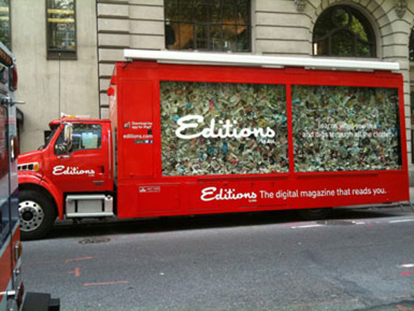
A Winner: AOL's 'Editions' Truck
 |
| Bryant Park. Southside. |
 |
| iPad stations & lovely, friendly promotional staff. |
 |
| Well designed. Flawless presentation. |
As I was strolling through the streets of Manhattan on this wonderful August summer day - the first one with California weather: 72 and sunny - my always wandering eyes were captivated by a very well executed promotional event, this one done by AOL.
In an earlier blog criticizing the makers of the reality TV show 'Swam People' for trying to score with a cheap publicity stunt (link see below), I wrote about the challenge of getting people's attention in New York City, where everyone and their brother are trying to get you to listen.
AOL did manage to do just that. And they almost got me to order an iPad online, because this editions app is actually quite cool. As I sat down on one of these chairs and played around with one of the iPads, a friendly, young lady came over and guided me through the program. She was well trained and very knowledgeable, although her eyes, at every question I asked, seemed to be trying to locate an invisible teleprompter hidden behind my left shoulder.
Editions, in a nutshell, is an app that pulls news content from various sources from the web and hence puts together your very own customized newspaper, similar to the social networking news aggregation app flipboard. It is pretty sweet. The only shortcoming is that you cannot print an article. Saving, archiving, and later printing are still quite somewhat essential for a writer. But perhaps I'm already part of a dying species.
In any case. AOL stopped me on a busy Manhattan work day, and got ten minutes of my attention. And hey, their promotional tour bus even inspired me to write about it. That is quite an accomplishment.
MAD SCORE: +5
Message: +1, because the iPad sells like hot cakes, and this app is pretty cool
Creative: +1, that is one impressive truck, and it's very well put together
Context: +1, because they understood that content is king, the medium (paper) only, well, the medium
Impact: +1, I predict this to be a success
Intangibles: +1, add the pretty ladies, and the 360-impeccably presented promotional stations, and AOL has got itself a winner
Related links:
For more about AOL's 'Editions' click here
Blog post 3/31: 'Cheap public stunt - Swamp people's fake gator'
More about 'Mad Ad Scores'
July 26, 2011
A wasted effort: John Hancock Financial Services
While traveling Europe a few years ago, I came across various kinds of markets, e.g. in Amsterdam it was a ginormous flower market, and in Hamburg quite a unique fish market. Both markets had one thing in common. Pretty much all the vendors offered the same thing: in Amsterdam flowers, in Hamburg fish.
Now who do you think sold the most flowers, or fish respectively? The silent vendors with the most subtle appearance, flying under the radar, trying to be smart? Or the ones that were screaming one witty punch line after another into the audience?
I can't really say that the dear folks at Hill Holliday, the advertising agency in Boston, who are responsible for this disaster, don't get advertising, and are a sub-par shop. Quite the opposite. Their latest work for Dunkin' Donuts actually earns a +5 on the Mad Ad Score scale. But their team working on its John Hancock account simply seemed to have gotten lost in a bad idea.
Why is this so bad? Well, let's go back to basics.
The TV audience doesn't watch TV to seek out witty commercials. They don't really watch the commercials. Commercials are a nuisance, white noise, thrown at you by the networks. No one asked for them. No one, except a few mad people like me, actually pay attention.
Hence, you cannot assume that the audience, in between Yankees innings, or the latest C.S.I. episode, are desperately waiting to read typed text on their TV screen that tries to sell them on financial products. Granted, the messages are relevant, and investing for one's retirement is a serious subject matter and shouldn't be left to chance.
But, please! Not making use of the audio component? WTF? Were the minds at Hill Holliday actually on holiday? Or were they just too much in love with their idea? Back to advertising 101: with a TV commercial you get:
a) :30 sec of moving images to tell a story, and
b) a radio commercial on top of it.
Still don't get it? OK, let's take the behavioral approach. Taking into consideration the behavior described above, it's pretty much safe to assume that most folks watching TV, while on commercial break, either:
- go to the bathroom
- check their iPhone, bberry
- grab their iPad, Laptop
- snack on some popcorn, get a drink
- read the mail, a newspaper clip
- ... you fill in the blanks here
The one thing most of them don't do is: watch! Yet still, they do have ears, and if they don't mute the TV, they still will - to some degree - be able to listen to your message.
If you do what HH did for John Hancock above (and there is a bunch of other very bad examples online, see link below), you are wasting pretty much half of your media buy on the home-TV-watching audience. Whoever is out at a bar won't be able to listen anyway.
MAD SCORE: -2
Message: 0, because no one is reading it
Creative: 0, it's boring
Context: 0, you got in front of me, but you didn't get through to me
Impact: -1, it's all together a wasted effort
Intangibles: -1, this has got nothing special to it
Related links:
More examples on Hill Holiday's agency website
More about Mad Ad Scores
July 25, 2011
Disastrous: Rihanna & Vita Coco Water

I have been in this industry for many years, and if there is one truth that has solidified itself over the years, it is that most of the advertising involving celebrities is poorly done.
And now they present to us: Rihanna & Vita Coco Water. Oh my... Not that the combination of the two is bad right from the start. No, not at all. But whoever executed this - both strategically and creatively - needs to be fired. Seriously. Why? Well, here is why:
ONE: THE MESSAGE
"Hydrate Naturally. From a tree, not a lab." Visual: Rihanna with RED, dyed hair. The color in her hair is clearly from a lab. It's beyond me that no one on the creative team got the irony of it.
TWO: THE IMAGE
Besides the fact that there is nothing natural about dyed, red hair, let's focus on the image. Rihanna is a beautiful, energetic person. That's how we know her. Yet whoever took this image managed to turn her into an apathetic, emotionless, neutral human something, void of any expression. What a disaster!
THREE: THE CAPTION
Whenever you have to tell the audience that the celebrity you are showing them is the celebrity you are showing them, in this case in UPPERCASE letters right next to her face, then you are doing it for a reason, right? Someone must have figured out that some people may not recognize Rihanna in the picture, which raises the question: if so, why choose her in the first place?
Michael Jordan never needed a caption of his name on anything bearing his image. Neither did Kobe, LeBron, or Michael Jackson. Yet according to Matt Delzell, an account director in the celebrity entertainment division of The Marketing Arm, the Omnicom agency who cooked up this dish: "She [Rihanna] is known by more than 82 percent of all US consumers -- she's about as well known as Gwen Stefani, Derek Jeter and Sting." If 82% know her, then why show the name? For the 18% who don't know her? Doesn't make sense to me.
HERE IS MY ANALYSIS:
In order to make the formula of 1) Rihanna + 2) Vita Coco work, the agency had two options:
A) THE LIFESTYLE-ROUTE
You turn Vita Coco into a 'lifestyle meets health' refreshing beverage for the young and hip. Rihanna lends her image. Vita Coco brings the health aspect to the table. You redesign the carton box packaging. Then you shoot the whole thing and create a visual where the energy of the shot makes the image vibrate on your page. Think of her laughing, thousands of water drops splashing, her hair flying... sounds familiar? You bet. Here is a screen grab from her 'Umbrella' video. Much more powerful than the dud they ended up producing.
 |
| Rihanna in 'Umbrella' |
B) THE HEALTH ROUTE
If Vita Coco is all about brand strategy, and a clear brand DNA, well, then they wouldn't have chosen Rihanna in the first place. They should have saved themselves a million dollars in fees, and put that money to good use by:
a) hiring a model that reflects the attributes 'natural' and 'health'
b) sponsoring regional, grassroots events, promoting a healthy lifestyle (the Wholefoods consumer is much more into credibility and honest messages than celebrity endorsements)
c) spending it on an additional million dollar media buy to get the word out
d) sponsor a 'Summer-Hydration-Bus-Tour', providing dehydrated citizens with all natural hydration all around the country
Any of these would have made much more sense than doing what they did, which is some weird kind of hybrid of A) and B), which is all wrong. And poorly executed. And just very, very bad. So bad - it hurts.
MAD SCORE: -2 (Yes, that's pretty bad)
Message: -1, because see above
Creative execution: -1, see above
Context: +1, it got my attention at a phone booth
Impact: 0, indifferent here
Intangibles: -1, too much is wrong with this mess.
For detailed criteria on the Mad Ad Score click here.
July 14, 2011
Raising Prices? Huge Mistake, Netflix!

Two days ago, subscribers of Netflix have gotten the email shown above, informing them that they now have to pay more. Just like that. No honoring existing contracts. No grandfathering down previous arrangements. No. You pay more now. That's how it is. Like it or not. That was pretty much the message. Of course they tried to suger-coat it in some nice ad speak language.
The public reaction has been tremendous. Just got to Netflix facebook page, and read some of the 62,000+ comments this price change has generated. That's 4% of their facebook fans. Many of them only 'liked' Netflix so they can voice their anger. Almost none of the comments were positive.
Customers feel betrayed, and taken advantage of. I myself was really angry, not because the increase was outrageous, but because of the way I was treated. Not like a valued customer, but like a cow that Netflix think they can milk any way they want.
Netflix simply has gotten arrogant. Or their Brand Management team is just very bad. Or they just don't care. Who knows. At the end of the day, this behavior show that they seem to have lost their edge, and have forgotten what made them successful in the first place.
The rise of Netflix, and subsequently the fall of Blockbuster has taught us one important lesson: a simple, yet significant change in the service you offer can win you millions of customers (by stealing them away from a big company that has gotten arrogant and slow).
Netflix and Blockbuster basically offered the same: movie entertainment. Yet while BB was relying on the old Store/DVD model, Netflix introduced DVDs by mail. Then they added streaming. BB never caught on, and when they tried to, it was too late to catch up.
So now Netflix is the big, arrogant player, and if there is any smart competitor out there, then listen: NOW is the time to win over hundreds of thousands of customers from Netflix. NOW they are open for alternatives. NOW they email, exchange information, listen to you. NOW. A week ago they didn't. In a week or two they might not. NOW is the time.
You bet that the majority of Netflix customers is angry. And if it's true that under normal circumstances only 1% of facebook fans are active commenters, then the 4% here show that this is an issue that Netflix has to take absolutely seriously. Or they are gonna take a major hit.
I canceled the streaming option. The movies were B and C movies only anyway. It was a 'nice to have', but not necessary. I kept the DVD by mail option though. That's where the good movies are. That's $8 less in their pocket a month. Take just 50,000 subscribers doing the same, and Netflix has lost $400K a month, or roughly $5 Million a year. I bet you though it is more than that. This is absolutely serious. Not sure Netflix understands.
July 13, 2011
Very nice: Toyota Venza Social Life
This one made me laugh. Someone here actually understood the meaning of the term 'social'. Just look at her, sitting there all by herself, with her 687 "friends". Online. On her "social" network. Does she look familiar to you? Yes? I am pretty damn sure you have someone like her in your circle of friends, constantly wired, either on their laptop, their iPad, their mobile device...
I run into these people on Manhattan sidewalks all the time. They are like androids, on remote control - walking, staring at their tiny screen, bumping into you. They sit in restaurants - just like the two girls today in a cafe on 7th Avenue sharing the same table - looking not at each other, but staring on the tiny screen in front of them.
They come to your dinner parties, house parties, or join you for brunch, only to whip out their iPhone, bberry, or whatever, and check their email, facebook, twitter or whatever. It makes me wanna scream.
My friend recently had dinner with her boyfriend, and I think he couldn't stand the bberry between them any longer. So he took it, and dumped it into the water glass in front of her. She got the message. Dinner now is quality time. No phone. No distractions.
And if you ask me - I'd rather hang with this girl's parents, riding my bike, and then enjoying a nice grilled steak somewhere.
Oh, and the car? Well, the message here is: "This is a car for fun people." Unfortunately, they don't tell us more than that. Still a nice story. Well done, Saatchi & Saatchi.
MAD SCORE: +2
June 3, 2011
Go digital, or die
SCENARIO 1
A veteran Creative Director in a major New York ad agency discusses the upcoming photo shoot with his team for a major national consumer brand, and the way he insists on traditional film vs. digital almost makes you believe that it is still up to the individual to withstand technological change. A million valid arguments were made as to why film was superior, and why digital was not an option. Two months later, the entire ad shoot was done. Digitally. The client demanded it. The CD simply had to go along.
SCENARIO 2
A senior Creative Director in a mid-level New York ad agency, with years and years of high-profile, wonderfully crafted, artistic branding campaigns in TV and print under her belt, is slowly being phased out of her high-profile job, as the demands for her particular craft slowly but steadily dwindled down. She simply did not think digital was something she had to embrace. In her world, there were these web-guys who would simply adapt her ideas in one way or another if necessary.
SCENARIO 3
A 15+ years graphic design veteran found himself out of a job one day. Without a warning. Just like that. He simply had decided to focus on traditional graphic design only, and left everything pertaining to web and animations to others. For him, learning one craft or tool was enough to get by. Apparently it wasn't. The next guy hired didn't exactly take over his position, but his approach to graphic design was much broader and holistic. He adapted. He changed. He constantly pushed himself into new territories.
What may appear to be three separate, unconnected events, are actually just a fraction of all the scenarios that followed a similar story line: He/she who resisted technological change, or did not recognize the significance of having to adapt to it, will be left behind, phased out, replaced.
What holds true for creatives, applies the same way to account planners, account managers, production folks, project managers, and pretty much everyone else involved in anything closely campaign-related. Adapt, or you will slowly disappear.
Digital demands are only going one way: up. Technology will get better. Bandwidth will get broader and faster. Smart phones, tablet PCs will become more and more ubiquitous. It's pretty much a no-brainer. Yet some people still have not gotten the memo yet.
June 2, 2011
Bad celebrity endorsement - Danny McBride for K-Swiss
 |
| New York Subway Platform Poster. Greenpoint Ave Station, Brooklyn. |
The typical formula for success: 'Sports Shoe Brand + Successful Pro-Athlete = Skyrocketing Sales'. It's worked with 'Nike + Michael Jordan = Air Jordan'. It's worked for 'Adidas + Kobe Bryant = The Kobe'. And the list goes on. Even the half-delusional Ex-Knick Stephon Marbury got a shoe deal and launched the 'Starbury' sneaker line.
But what on earth is K-Swiss doing?
ONE. They throw out a product that is quite similar to Reebok's 'Reezig' shoe line. Nothing wrong with that. That's what the apparel & shoe business is all about - taking inspiration from successful new product launches, and then throwing your copy of it on the market.
TWO. They hire actor Danny McBride to endorse their 'Tubes' version of this kind of shoe. But then again, not really. The sign-off on the ad reads 'Kenny Powers'. Who on earth is Kenny Powers?
This is where the confusion begins, and this is where this whole thing goes awfully wrong.
Kenny Powers, according to Wikipedia, is the fictional main character from the HBO show Eastbound and Down. It's about an ex-baseball pitcher trying to make a comeback. Ahhh. OK. So here is the sports-connection.
And here is the rationale as to why this money spent can be put right into the 'sunken cost' column:
A) CONFUSION
While we certainly recognize the face of the actor, the signature on the ad doesn't really ring a bell. That's until you google it.
B) THE HBO DILEMMA
B1) Not all of my friends have Cable.
B2) Not all of my friends who have Cable, have HBO.
B3) Not all of my friends who have Cable, and have HBO, watch the show.
And I challenge you to ask ten of your friends if they do. I'll buy you a beer if more than three do.
Wow. That's a fraction of a fraction of a fraction of an audience you need to reach in order to make the connection between the shoe and the face right next to it. Who thought of this? But furthermore: How dumb is this? How stupid actually? How bad? Oh my...
C) THE DANNY MCBRIDE PROBLEM
Everyone else of the non-cable, non-HBO, non-show-watching population, knows actor Danny McBride mostly for his goofy characters from movies such as 'Your Highness', 'Tropic Thunder' or 'Pineapple Express'. Not exactly the stuff that lends credibility to a K-Swiss sports shoe.
Unless you want to be the known as the 'silly, don't take me serious sneaker for clowns'. Dear K-Swiss marketing team: is that really what you want? I doubt it.
If I'm missing the point here, please feel free to enlighten me. I'm sure someone in the marketing department or the ad agency you paid wrote up some marvelous strategy deck that make you all nod in unison.
MAD SCORE: 0
Message: -1 (confusing) / Creative: 0 / Context: +1 (good media placement) / Business Impact: 0 (it will do neither good nor bad) / Intangibles: 0 (I see absolutely nothing here)
May 25, 2011
Wonderfully bad: Acura LT
Acura currently runs both of these, and as much as they are beautifully shot - filming, sound, edits etc. - they are both terribly bad in their conceptual approach.
What exactly is the analogy here? I have no idea. So let's dissect the message.
"It works with people. It works with cars."
What exactly works with people? They don't tell us.
What exactly works with cars? They don't tell us either.
Instead they show us two athletes, first dressed in their sweaty, dirty sports gear, then being re-dressed in fancy outfits. So what does that mean? What are they trying to convey? What's the message transfer to Acura?
A) If you take a used, dirty Acura, and clean it up, and put fresh paint on it, you can sell it as a new Acura?
B) If you take a used, dirty Acura, and clean it up, and polish it, it looks much nicer?
C) In every Acura, there is exactly the same old stuff under the hood, and the chassis, and they simply throw on a different shell and throw in a few extras, and then sell it as new?
D) Acura doesn't really invent cars, they just dress them differently? So every Acura they sell is really an old Acura dressed in a contemporary outfit?
I don't get this one at all. I don't get the message. I don't get the analogy. I don't get "it", that "works with people and cars".
Having worked years in this industry, I assume this is what happened that makes this such an awful commercial (a beautifully shot, but conceptually awful one):
1) Agencies these days squeeze their creative staff too much. Too many ideas in too little time. Not enough thought is given to analyzing the concept chosen.
2) Internal hierarchies. Whether the seasoned CD liked this idea, and the junior AD just kept his mouth shut, or the junior AD kept pushing, and the seasoned CD didn't care - all possible scenarios how this got out of the creative lounge.
3) A team that has no car experience. Or a creative team that doesn't drive cars. Or a creative team that doesn't get cars.
4) A creative team that would rather do fashion advertising than car advertising.
5) Ideas like these get passed the client, because the ad people explain them five million times, until the main client says: "Ah, I get it." Then everyone else nods, they shake hands, and a gazillion dollars is spent on celebrities, staff, production, and media. Wow!
Problem is: Average Joe Smith out there does have anyone explaining this to him. Neither have all the other million of people in front of their TV's. They might all be shaking their heads.
Or I am overanalyzing. Or I am loosing it... and it's time for me to start scouting retirement homes.
MAD SCORE: 0
Message -1 / Creative +1 / Context: +1 / Impact: -1 / Intangibles: 0. What a shame. So much money spent on such a poor concept.
May 24, 2011
Preposterous: HTC's 'Every idea we have...'
How ridiculous is this commercial? As we are now in 'Year Three of the iPhone', HTC seriously wants to tell us that "every idea we have begins with you"? That is absolutely preposterous. It's not a shame to come late to the party, but making such a claim to carve out your point of differentiation? Seriously?
Let's make that: "Every idea we have beings with Apple." Period. That's what I'm getting from all this. Big screen smart phone? Idea taken from Apple. Flip / touch screen? Idea taken from Apple. And the list goes on.
Besides that, there are a few scenarios in this short film - or 'vignettes' they created - that make absolutely no sense. Watch for example:
0:07 (he taps her on the shoulder): "the way you connect..."
// This is how we connect? What? Certainly not. If man approaches woman in such a way, he freaks her out. We pretty much learn that in high-school. This is a little bit too far-fetched.
0:10 (turns a page in a magazine): "how you browse..."
// What? I just tried this 'one finger magic with GQ magazine, and it didn't work. Again, why do they create these ridiculous vignettes?
0:16 (flips down the kick stand): "and how you interact with the world around you..."
// WTF? Someone please tell me what I'm communicating and whom I'm communicating with when flipping down the kick stand. That doesn't make any sense at all.
0:22 (windshield wipers): "down to the last detail..."
// "... you inspire everything". This is so stupid. Great, someone at HTC came up with a gimmick the iPhone didn't have - windshield wipers - but the benefit of having it is about as valuable to the individual user as these silly beerglass / naked girl apps.
I'm not saying this is a bad phone. It might be very good. Perhaps even brilliant. After all, HTC's tag line "quietly brilliant" pretty much implicates as much.
So why don't they take the 'brilliant' part and develop it into an idea? Not by showing the phone's features - Apple's done that already - and everyone else just looks like a copycat. But by creating a series of films about "brilliant" people and the "brilliant" things they do with their HTC instead?
MAD SCORE: +1
Just because the mobile revolution cannot be stopped, and selling a half-way decent smart phone in times like these is about as difficult as marketing gasoline to Americans.
May 12, 2011
A winner: Budweiser's 'Coming Home'
There is not much else to say about this other than: "Dear Budweiser folks, I wish you would put as much dedication and love into your beer-like substance as your advertising people put into the creative concepts."
This is real. This is happening. All across the country. "Proudly serving those who serve" also is a great way to take a step back, be humble, and put someone else into the spotlight. This is how you build a brand beyond the product. Fantastic!
Real people. Real scenarios. Not too fancy. No models. No super star athletes. These are the people next door. The hero - we all see him every time we board a plane. The brother. The sister (?). The mom. The dad. There is even a tear on the girl's face at 0:51. A wonderful story. Captivating. Moving. Brilliant.
MAD SCORE: +5
Just extremely well executed on all levels. If only the beer were as good.
May 11, 2011
Too cocky: BlackBerry Playbook

What is it with the consumer electronics makers of the world these days? First Apple started to play an arrogant tune in its "If you don't have an iPhone commercials", now BlackBerry kind of does the same.
"Amateur Hour is over", is what they told us in a ginormous banner ad on the New York Times online on May 6th. Are they serious? First, they are late to the party, as pretty much every other tablet maker putting out its me-too-product these days (Motorola, Dell, Samsung...), and then BBerry pees in the pool and complains that the water is dirty? What?
Because here is basically what they are saying: "Up until now (and by that they refer to Apples iPad, because all other tablet clones out there are late comers as well), everyone was playing in kinder-garden. Nothing serious has happened. Until now of course. Until we - BlackBerry, the makers of the mobile communication device for professionals - came up with our version of the tablet pc. The one for Professionals."
Which is kind of a joke if you look at the name they gave its product. They called it PLAYBOOK. That is f...... hilarous! I don't think they get the irony, the contradiction of their own message. Unless this is the PLAYbook for professional (not amateur) players? Nah... i don't think so.
Anyway, here is what I think they intended to do. They wanted to carry over the credibility they had gained in the professional business area with the BBerry into tablet pc territory. They just ended up choosing the wrong message. Something along the lines of GMC's 'We are professional grade' would have made much more sense. Why?
Apple's iPad was the first to the party, and pretty much owns the category. Their war chest with ad dollars is too much to overcome. You can't outspend them. Their communication is all centered around play, and a little work. They own that territory in the consumer's mind. What's left? The 'Pro' area of course!
"Watch out. The Pro's are coming", or something along those lines would make much more sense, and I haven't even really thought this through yet. Apple = play. BBerry = Pro. Everyone else? Look at their advertising. They are trying to communicate the same advantages as Apple. Doomed to fail if you ask me.
Now BBerry of course would have to rename the product. I doubt they will though.
MAD SCORE: -2
Great media buy. Wrong message. Wrong product name. Who approved all this?
May 10, 2011
Big time loser: Taco Bell's 'Winner'
I am running out of words these days. If anyone can find a better alternative for "annoying", please email it to me. Because I am pretty damn sure I am not alone on this one... this guy is just so (insert word here) - I want to punch him in the face every time this commercial airs.
Besides the good, the bad and the ugly, there is another criteria category that hasn't been fully explored yet - I'd call it 'Repeat Watch-ability', meaning how does a commercial resonate with the audience after multiple runs?
I bet there are some - like Heineken's The Entrance- that you enjoy watching over and over again, and then there are those that make you jump up from the couch, reach frantically after the remote and switch the channel, because they are so damn (insert word here again), such as the latest McD commercial for example.
This "I got a winner" concept is one of those that you, as an advertiser, can run for about a week, before the newness wears off and the powers of advertising turn over to the dark side, and consequently turn the audience against you. Why?
ONE: You, as the advertiser, are announcing some new version of the ever the same fast food fare, just packaged differently. Taco Bell is Taco Bell. It is what it is. Weather or not it will be a winner the consumer will decide. So don't lean out of the window too far, you might come down hard. And yes, we got the message. A winner. Thank you. Now stop it.
TWO: If this version airs too often, the audience will eventually notice how dumb this concept is. Who on earth serves Taco Bell at their party? Seriously?
THREE: There is something strangely sexual about one girl saying to the other "He thinks he's got a winning taco". Again, this happens only if this airs too often. In any case, I am pretty sure the guy went home alone after the filming was done.
FOUR: Can you imagine a guy like this at your summer party? You would punch him, wouldn't you? You'd think he's on drugs, no? Either way, you'd pretty much hate him, right?
FIVE: It shows that this is one of the mass-market-ad-concepts coming out of a mass-market-ad-manufactury, where quantity is chosen over quality. No one thinks it through very much. It just comes out of the advertising machine one after another. No love involved.
SIX: Look at the expression on the extras' faces in the background (at 0:27 for example) - they all feel strangely uncomfortable in the presence of this guy. The poor guys and girls who had to endure multiple takes of this highly annoying dude - I feel so sorry for them.
MAD SCORE: -3
A shorter media buy would have gotten a +2 score, but the annoyance factor is just way too much.
May 9, 2011
I am dreaming: Corona's 'Find your beach'
Here is a brand that clearly owns a territory in every consumer's mind - the beach. They have owned it for years, and if they don't screw it up, they will own it for as long as they wish. Cramer-Krasselt was the agency that originated the beach-concept, and Corona should be paying them dividends for as long as this concept airs.
The above version is a slight deviation from any previous iterations of the beach concept. It seems the Corona folks are trying to expand their brand territory, leaving the beach, and move into new territories. A smart decision? I don't think so. I hope it's only a one-off, and they stick to the beach.
I get the 'Find your beach' idea. I am just not sure if I am looking for it in the mountains. The color of the Corona beverage in my mind doesn't fit together with snow-covered mountains, or a lake in what appears to be Michigan or Washington. Corona equals beach. A tropical beach that is.
Nevertheless, this is a brilliant commercial, very well executed on every level. The soundtrack is perfect - it takes you on a 0:30 second vacation to various places. Why am I sitting in an office tower in Manhattan again? And after all, they tie it back to the beach in the end.
On a side note: whoever came up with the idea to film the actors/models from behind should be paid 1/10th of all the money Corona saved in not having to pay full usage rights for the rest of his life - it must have been hundreds of thousands of dollars over the years.
MAD SCORE: +5
Although the above version in my opinion only scores a +4 - due to the fact that they are leaving the beach temporarily - the overall Corona beach concept deserves a +5, and should included as a case study in any text book on advertising.
May 7, 2011
Absolutely wonderful: J. Crew banner on nytimes.com
 |
| The final frame of the video, linking to the J. Crew website |
They seem to get everything right these days, the people at J. Crew. Ever since Mickey Drexler took over the helm a few years ago, many good things have happened. They put out great new product, they revamped the in-store experience, and they simply create wonderful communication materials. Everything is connected. There is a cohesive visual thread, and it's all very professionally done.
Take the above for example. I noticed it this morning, browsing the New York times online. Its placement is rather modest. It doesn't try to jump into your face like so many expandable rich media banners that stretch your entire browser window to almost twice its size, leaving you angry and annoyed. No, this one sits modestly on the lower right hand side on your screen, with the sound turned off, waiting to be discovered.
What caught my attention was the charmingly done creative execution, making me curious, so I turned the sound on. I ended up watching the flash video five times, before I realized I had to share this. And please click on the link below and check out the J. Crew landing page - they brilliantly continue the "tapping" theme. Love it! Perfectly done!
MAD SCORE: +5
Because it gets people's attention. It's beyond cute - girls will love it. And they will buy tons of these flats. Oh, and expect the song on your friends' iPods shortly - it's quite a catchy tune and super cute. I just downloaded it.
Related links:
Download the song here (J. Crew website)
May 6, 2011
Fast and Furious: Liquid Plumber
This is a fantastic commercial. It's simple as one-two-three, and the message sticks.
ONE. Track & field arena. 100meter dash. A guy in a blue work suit? Question.
TWO. Super fast. Totally over the top. Totally funny. Haha.
THREE. Tying it back to 'Liquid plumber'. Got the message. Thank you. Question resolved.
One message. Very well executed. Not trying to do too much. Right on target. This is neither the 'environmentally friendly' product, nor the 'smells like spring' liquid. No, this is fast. Super fast. Love it!
MAD SCORE: +3
There is a newer version in a different edit that works even better. That one gets a +4 score.
May 5, 2011
Really huge: NBA's 'Bigger' Playoff commercials
These commercials are simply fantastic. Granted, the client and the subject matter make it a little bit easier for a creative mind to come up with something 'cool'. They actually make it almost impossible for you to screw up. Unless you put a couple in the stands, and she calls him "Mr. Snuggles", and he refers to her as "Sweat-Tea-Pie", because he got the McDonalds combo from the concession stands.
Back to the NBA. I love this one. It is over the top, and brilliantly so. NBA stars think of themselves as larger than life. And bigger they are, not just in size, but also in terms of their paycheck. So why not turn this truth into an obvious one?
Sound, rhythm, editing, message... everything here is right on target. Plus, it's fun to watch.
MAD SCORE: +4
Only because a +5 has to be really, really outstanding and knock your socks off. And as I said, it's hard to screw up an NBA commercial, unless...
May 4, 2011
In-genious: In-finity's 'In-Crowd'
Sometimes I am not so sure whether I live in The capital of the world or just a (global) village. I mean, everyday we are surrounded by the biggest, and the best, and the most expensive companies, products, and subsequently advertising placements in the world.
So you would expect for things to constantly get better, for marketing and advertising folks to learn from past mistakes, to strive for perfection, no? Well, life would be boring if everything would simply be perfect, wouldn't it?
Thank God there is In-finity of Manhattan. They are to the automotive industry what the infamous 'Dr. Z' is to the medical profession - an icon of bizarre advertising. After having disappeared for a while, his subway car ads are now back, and his smile is brighter than ever.
But back to In-finity of Manhattan. I still don't know whether I should laugh or cry every time this commercial airs in the New York area. It is just so ... weird. Why?
ONE. The bizarre mix of various 'VIP-style' scenarios and homemade VHS quality.
TWO. The in-geniously absurd copywriting, putting the 'in'-sanity almost to the maximum stress test. Seriously, how many 'in'-this or 'in'-that do they think it takes for the average 'in'-habitant of the U.S. of A. to get the idea?
THREE. The soundtrack. It's 2011, yet the sound seems to come from a 1980ies porn movie spoof of Magnum meets Lethal Weapon.
FOUR. All the hilariously funny, weird moments in this thing: watch the woman spin her head around at 0:13 sec (in sync with the sound!), the odd couple (straight out of a Sopranos episode) exiting the restaurant / club at 0:21 sec, or the grand musical finale at the end. Ta-taa!
I am crying so hard. I just don't know why.
MAD SCORE: n/a
Because I simply cannot say whether this is in-genious or in-sane.
May 3, 2011
So annoying: The latest McDonald's commercial

What the hell is going on in the McDonald's marketing department? What on earth is going on in the creative department of McD's ad agency? What the f have they been smoking?
I had hoped they had gotten enough complaints to stop that nonsense after their previous couple commercial - the one with the guy who's got no balls. Remember it? It hurt so bad watching the guy make a fool of himself.
And now this? It makes me cringe so badly inside - I am at a loss for words. The good thing is that there is consistency in the creative execution as both have obviously been developed of the same creative brief. So what on earth were the account planners on this thinking?
Are they trying to educate us men, trying to turn us into sissies? Are they trying to target the female population? What's the deal here? Their food obviously sucks, so they can't turn that into a story, but this? Turning McD into a 'couple's destination'? A dating spot? This is so f...ing ridiculous, I am going to throw up.
She calling him "Mr. Snuggles". He - because he is really smart (he chose McDonalds!) - calls her "Sweat-Tea-Pie"?! She in return calling him "Chipmunk"?! Someone please punch someone for this. Very hard.
There is something so innately animalistic in sinking your teeth into a juicy burger. This is male territory. It's embedded in our genetic code. It takes us back to a time when we were still living in caves, guarding the fire, like the millions of men barbecuing in the summer, proudly flipping those char-grilled patties in their backyards. It's millions of light years away from this disaster. This is one that makes me really, really mad.
I couldn't find a link to the commercial yet - if you do, please email me and I will update the post.
MAD SCORE: -5
Because it makes me not want to eat McDonald's anymore, and makes me angry. Seriously.
Update 8/5: Finally found the video. Click here to view.
May 2, 2011
Introducing: Mad Ad Scores
I've been thinking about assigning each ad being reviewed some kind of score for quite some time now, and after evaluating various options, I have landed at a simple solution.
The first option contemplated was a 1 to 10 point scale, with 10 being the maximum and 1 the minimum score. Something didn't feel right about it though. Another option was the U.S. five letter grading system that most of us know from high-school or college, with the A+ being the top score, and the F the bottom score.
While both options were pretty similar, both would assign scores on the positive side of the spectrum. While I think this is fine in high-school and college, where you can be lazy and pass each school-year with a 'below-your-capabilities-performance', without any fear of retribution, and the opportunity to make up for it by going full throttle in your senior year, chasing those straight A's, you can't do that as a professional.
Once you're out of school, and you're in the big leagues of advertising, you need to be: professional. Competition is tough, keeping an account is not a given, there is constant pressure from shareholders (if you're publicly listed like IPG), or stakeholders, clients, society, consumers... you name it. The stakes are simply too high to fail, to put out bad work. Yet it happens so often.
Seeing so much bad advertising out there, I've come to realize that a simple 'D minus' or an 'F' doesn't do it justice. The range needs to be spun wider as bad advertising hurts your organization, not just financially, as the money spent on it is gone (think: sunken cost), but much more so economically in a wider sense.
Once the message is out there, it is unclear what kind of damage it can do to your brand. What you think it will do is not always what it is going to do. The consumer is a mysterious species, and the 'homo economicus' simply an illusion.
So here it is: Introducing 'THE MAD AD SCORE', or for matters of simplification, 'THE MAD SCORES':
-5 / Minus Five = The Worst. So bad it hurts.
-4 / Minus Four = Second to worst. Close to imperfection.
-3 / Minus Three = Medium bad. No reason to be proud.
-2 / Minus Two = Bad, but not as bad as it can be.
-1 / Minus One = Causing just a little damage.
0 / Zero = The neutral zone. You'll go unnoticed.
+1 / Plus One = You must have done something right..
+2 / Plus Two = Batting .269 while you think you're a .300 hitter.
+3 / Plus Three = Not many make it here. Big leagues. Clearly.
+4 / Plus Four = You can pat yourself on the shoulder. Great job.
+5 / Plus Five = The few. The proud. The Wizards of Ads. Bravo!
Notes:
When assigning scores to ads, the following criteria are taken into consideration:
1 - THE MESSAGE
Is it clear? Is it concise? Is it contextual? Is it fresh? Or does it confuse? Is it too complicated perhaps? Is it trying too much?
2 - THE CREATIVE EXECUTION
This includes aesthetics, casting of characters, use of celebrity endorsement, use of voice over, symbols, icons, logos, colors, camera movement, on-screen-display etc.
3 - THE CONTEXT
Is the medium well chosen? Is it wise to put ads for certain products on public garbage cans or in public restrooms? Are $3M spent on :30 sec during the Superbowl well spent?
4 - IMPACT ON BUSINESS
Does it help the brand? Does it positively or negatively impact sales? Is it merely neutral?
5 - THE INTANGIBLES
That certain something that cannot be foreseen in a creative brief. The great idea, the one ingredient that sets you apart. Like Sealy's line 'Whatever you do in Bed - Sealy's supports it'.
Each of these five criteria gets a score of either -1 / 0 / or +1. They are being added up, and all combined make up the MAD SCORE.
April 13, 2011
R.I.P. Flip camera
 |
| Bye bye flip. |
So Cisco decided to kill the flip video camera. Good decision? I am not sure. The word on the street has all facets of opinions.
Stephen Baker, Industry analyst from NPD calls it "a bad decision on so many levels that it is difficult to fit them all into one discussion." For a thorough comment I left on his blog apparently was not much space either as NPD decided to delete it. I had partially disagreed with the limited analysis as it only focused on past and current sales data, lacking a future outlook. It must not have sat too well with the NPD folks.
Sam Biddle from Gizmodo sits on the other side of the spectrum. He seems to welcome the decision as he calls the flip "a product nobody needed anymore or cared about." (links to both articles at the bottom of this article). I tend to disagree with him as well, for various reasons, and I want to tell you why both of them are wrong.
ONE: Mr. Baker from NPD calls Cisco's move a "cowardly act". Au contraire. In the business world, this is called a strategic move. Cisco made a strategic decision not to be in the consumer domain any longer and focus and invest in other parts of their business. So what? Apple is a consumer company. Cisco is not. Remember Sega? They decided to shut down their gaming console business when Microsoft announced they would enter the market. Sega was still doing solid numbers at the time. Nevertheless they left the playground. Simple business strategy.
TWO: Mr. Baker criticizes Cisco's "relative lack of exposure to consumer trends". Well, if you are a consumer goods company, then that would be disastrous. If you are not, and your value and supply chain is well integrated, and you are working with your business partners in harmony, then you need not worry about consumer trends. Your business customers sitting at that end of the value chain will take care of this part. This is called the division of labor and the focus on core competencies.
THREE: Mr. Giddle thinks "the blame should be aimed squarely at the smartphone in your pocket." According to the NPD market evaluation, flip was still doing pretty well in 2010 compared to 2009. Yes, the smartphones got better. Yes, the smartphones got smarter. Yes, the camera functionality got better. Yes, yes, yes, But! Does that mean flip never had a chance?
The good thing about NPD is that they have got the numbers. The problem with NPD is that they are too focused on their numbers, and can really only comfortable voice an opinion until the last submission from their retail sales tracking software. The good thing about Gizmodo is that they know their tech stuff. The problem with Gizmodo is that they too easily get lost in the technicalities of things, without a broader outlook.
Here are a few thoughts how flip could have lived on, or could have been saved (in my opinion of course. You are entitled to disagree.)
A) FROM FLIP CAMERA TO FLIP-PHONE
Cisco, as part of their business strategy, could have decided to enter the smartphone market by turning the flip camera into a flip smartphone. flip has a strong, and solid following, and it would have been only an evolution, a continuation of a story vs. the introduction of a completely new device. Other devices, such as Garmin or Nuevi GPS navigation devices have chosen such a strategy. If they will be successful, only time will tell.
B) KEEPING IT SIMPLE
Technical devices, especially in the digital day and age, tend to become more and more complicated with each version. More features, more buttons, more menus. Consequently that all adds up to more complexities, and I challenge you to confidently say you have already explored your devices capabilities at 100%. I actually doubt it. I just recently had a friend discover the 'Zoom' function on her iPhone after she had it for over a year.
This would have been the chance for the flip. Keeping it simple as 1-2-3. Not too many buttons. No confusing menus. Add to that Moore's law and the tendency of lower production cost as time moves on, and the flip could have been a low-cost device, easily replaceable and disposable. Not a big tragedy if it gets lost (vs. losing your iPhone or bberry!), but always a fun toy to have around at weddings, birthday parties, hiking and biking trips, you name it. Going Ultra HD with the flip was the wrong way. There is no way you enter the professional domain with this tiny device. Going the other way would have been a better option.
But Cisco apparently decided not go invest in R&D, and marketing, and a sales staff for such a device. So end of story. R.I.P. flip camera. You will (or will not) be missed.
Related links:
Stephen Baker's NPD Industry Analysis
Gizmodo's post
The flip website
April 7, 2011
Brilliant - NCAA's 'Going Pro'
You may criticize the NCAA for taking advantage of their student athletes. While the league is raking in hundreds of millions of dollars year after year, it doesn't even allow its athletes a free meal. But that's another story.
What they have done right for many years, however, is their advertising. Year after year after year. There is a consistent message. Actually, it is exactly the same message. The only thing that changes is the creative execution that keeps it fresh, keeps it contemporary. The commercial above actually ran last year, but it doesn't matter, as you will see many versions on tv this year that all play the same tune.
"There are over 400,000 student athletes, and just about all of us will be going pro in something other than sports."
Wow! Speaking of strong messages. It cannot get any more powerful than this one. While the rest of the sports media focuses on the very few, lucky ones that get drafted by the NFL or the NBA every year, and hundreds of sports writers try to top each other with their draft, and pre-draft, and pre-pre draft predictions, the NCAA spends money to focus on the other 399,600 athletes, reminding us that there are more important things in life than signing a multimillion dollar pro-sports contract. That's a powerful message. I hope the NCAA will keep it this way. Forever.
After all, imagine you're a rookie on a NFL team, your knee gets shattered in the first game of the season, and you end up with a doctor such as the one in the Sprint commercial reviewed yesterday. Better to get a degree, and a real job, no?
April 6, 2011
Sending the wrong message: Sprint's 'Injury' commerical
Ok. We get it. Fast network. Low monthly fees. But that's not the message here. There is something so fundamentally wrong with this commercial, I don't think the creatives who wrote this script ever thought about the deeper implications, or they didn't care.
The story that carries this commercial, is a very realistic one. Every season, quite a few professional athletes get seriously injured, and very often with career-ending injuries. There are tragic stories out there, and every once in a while we read about them. But the individual tragedy is not the subject matter here.
The underlying message implicit in this commercial is this: Although my profession is one that should be defined by helping others, by unselfishness, and by compassion, I don't give a damn. I am only acting selfishly, without caring about you at all whatsoever, only having my very own, personal benefit in mind.
The other few versions of this series are not as bad as this one, but they all carry the same message: I don't care about you. That's the takeaway for me from this series of Sprint commercials.
It is the same egotistic human behavior that made commuters on a San Francisco freeway scream "jump" at a suicide candidate, who had been blocking a bridge, from which he intended to jump, for three hours. It is the same self-centered thoughts we have when a co-worker gets laid off, and we crawl back to our cubicles not thinking about him or her, but about ourselves instead: Thank god not me. Better him than me. It is appaling. Definitely not the right message to wrap your cell phone services around.
Tomorrow will feature a commercial that does the exact opposite.
April 5, 2011
Powerful message: Anheuser Busch's 'Thank You' commercial
The commercial is already a few years old, but there is something incredibly powerful about this message. It gets under your skin - whether you like the beer-like substances Anheuser-Busch sells or not (I don't). But I do like this commercial. It shows you why AB is always on top of its game (except for their brewing skills).
Thank you.
April 4, 2011
Yuck - BK's Meat Math Commercial
Sometime during the NCAA tournament, Burger King introduced their 'BK Stacker' sandwiches with the above commercial. From the first time watching it, it struck me as odd. Here is my interpretation of it:
Opening shot: We see a sign reading 'Meat Mathematics Institute'.
Me: Mathematics Institute? What?
Then the voice over kicks in: "The world's foremost meat mathematicians were summoned by Burger King to solve this equation: How can we achieve maximum meat flavor for minimum money?"
Me: Yuck! Not real chefs in the kitchen, trying to achieve maximum TASTE, but scientists in a lab, trying to go for maximum FLAVOR! Yuck! This has artificial flavors, filler materials, and other disgusting ingredients, all cooked up in a science lab, written all over it! It brought memories of the movie Fast Food Nation back, instead of stimulating my taste buds.
Furthermore, they are trying to achieve it for "minimum money"? Oh my gosh... now they are telling us that they don't put very much into it (certainly not the best ingredients), and that they are a very cheap company, trying to save themselves as much money as possible when putting together the burgers they sell to us. It doesn't come across as savings for consumer, the way it was intended.
Last but not least, "achieving maximum meat flavor for minimum money" is an economic impossibility and misleading, because you can either try to achieve:
a) maximum flavor - at whatever cost associated with it (depending on the market price for wagyu kobe beef for example, and the exclusivity of the cheese on top)
- OR
b) minimum money - meaning you know what you want to sell the damn burger for ($1, $2, $3), you know the cost structure of the burger, which ultimately dictates how much real beef you can allow yourself as a company to put inside the burger.
Doing both - a) and b) is impossible. Anyway, the thought of scientists calculating my burger is stuck in my mind now, and I find it quite disgusting. I think I have had enough BK for a while.
March 31, 2011
Cheap public stunt: Swamp people's fake gator


Hardly a day goes by without the announcement of yet another reality tv-show. From the Real Housewifes from almost anywhere now, to Jersey Shore, to Alaskan State Troopers, to Deadliest Catch, the list goes on and on and on. We have seen men driving 18-ton trucks over frozen ice (Ice Road Truckers), followed a bunch of men on their quest for gold (Gold Rush Alaska), and even Sarah Palin jumped the bandwagon with her very, very boring own reality tv-show (Sarah Palin's Alaska). Reality tv-show overkill if you ask me, but that is another discussion.
In this endless sea of sameness, how do you get people excited about yet another reality tv-show? The people behind History Channel's new show Swamp People must have thought it might be a good idea to put up a fake manhole with a fake gator, all sectioned off on a Manhattan sidewalk with branded, fake barricades.
I get the idea. I get the thinking behind it, but the execution is just very disappointing. It looks very cheap, like someone walked into a props or toy store, and put this together for a child's birthday party. The way they pulled this off may work in a mall in suburban America, but in the epicenter of communication overkill, this one comes across as plain, cheap and lame. I stood there for a few minutes, and watched people's reactions, and trust me: people walked past this thing without even raising an eye brow.
It's pretty sad when you think that the effect is completely lost, especially since it takes some effort and money to even put this small stunt together: you need to get a permission for the city to fence off a section of the sidewalk, you need a guy from the production crew to be there all the time (to make sure no pedestrian gets a heart attack? The guy was sitting in the car parked right next to it), and all that for pretty much nothing.
If you come into Manhattan, and you want to pull off a public stunt like this, my recommendation: go all out, and make this HUGE. Set up a real pool at Union Square for a day, with a real gator, and make it an event. Sure, it will cost more, but that is what gets the New York press excited, and earns you tons of free editorial coverage. You might even make the morning, and the evening news. New Yorkers love this kind of stuff.
March 29, 2011
Too arrogant - Apple's 'If you don't have an iphone' commercial
(Note: 5/13/2013: Above video is an alternate version since the original one was taken down from YouTube)
Are the tides turning? Is Apple finally moving over to the dark side? Or did they fire their ad agency, and hire a cheaper one? Because the above tv commercial that is running these days actually feels like a very bad Microsoft ad, not like one of the many, witty Apple / iphone ads we know. Those all had a lightness, a freshness to it. They were surprising us constantly with new bands and songs that we came to love. Not this one though. This one is bad. Very bad.
I have to admit, I do have an iphone. I do, however, not agree with the quite arrogant undercurrent that is embedded in this commercial. The line that carries this commercial:
"If you don't have an iphone... well... you don't have an iphone" actually makes me quite angry, because you can just as well translate it as "If you don't have an iphone... screw you". This does not feel like Apple at all. It feels arrogant, and condescending, and pretty much shows the finger to all other smart phone users. Apple shouldn't take that route at all.
There is one line in particular in the commercial that makes matters even worse:
"If you don’t have an iPhone you don’t have iBooks, so you don’t have your favorite books in your pocket."
That is just awful copy-writing, and there didn't seem to be a creative brief in place at all. Have you ever tried to read a book on an iphone? It's a pain in the .... I have always resisted electronic books, but just lately have warmed up the Amazon's Kindle, which would actually be much more suitable for a a copy line like that. But not the iphone. Come on! You can't be serious.
I hope Apple will find its Mojo again. Because arrogance certainly does not sell.
Question to you: If you don't have an iphone - did this commercial stimulate your desire for one? Please feel free to drop me a line or share your thoughts in the comments section below.
Related link:
Apple's iphone ad gallery
March 28, 2011
Managing liquidity - literally
 |
| Rosenthal & Rosenthal bank in Manhattan |
 |
| Managing liquidity - really? |
Here is an example of a New York bank that does what banks are supposed to do - handle money matters for its clients. Nothing wrong with that. That's what banks do. When they do it well, it helps the economy prosper. When they don't do it well, things end up being a mess as in 2008.
Rosenthal & Rosenthal in midtown Manhattan has a poster hanging in its window that reads:
"We help companies better manage their liquidity". So far so good.
Then, however, they do something really funny, and weird. They illustrate their message by - literally - visualizing the term 'liquidity'! How bad is that? I can't believe they are seriously showing a water bucket that has a tiny hole poked into it, from where water runs into a drinking glass! Oh my... that is just so awful! Why?
One: I think it is fair to assume that the target group for Rosenthal & Rosenthal is smart enough to know what "managing liquidity" in the financial world means. I mean, we are not talking about a consumer savings bank in a low-income suburb with high rates of illiteracy where you have to take a very simple approach to explain the term 'liquidity'. We are talking Manhattan business district.
Two: Everyone reading this ad, and seeing the visual, has to make two mental transfers. Transfer 1: Private bank - to - liquidity & the literal water bucket. Then transfer 2: liquidity & water bucket - back to - its original meaning in the financial world. It's completely unnecessary, and actually confusing.
Three: By doing the above, the ad is actually very two-dimensional. It doesn't have any depth. It comes across like a concept developed by a fourth-grade student. It is too simple.
Four: The best part - it doesn't even make any sense. The visual going along with the message is completely wrongly chosen. If we analyse it correctly, then it implies that the bank has HUGE amounts of the clients money in its vault (the big water bucket), but only releases a tiny bit at a time to the client, but in a constant flow. There is no 'managing' illustrated here at all! If they wanted to at least get this minimalistic approach right, then there should be a faucet, with someone turning it on and off, no?
What happens, for example, in the picture above, when the glass is full, meaning the client has enough money (liquidity) for the moment? Does the bank just keep pouring it out? Or is someone coming over, putting a finger on the hole in the bucket? I don't get it. This is so stupid!
I have seen a few scenarios in my career, where similar sub-par results like this were brought to life. It usually happens when not too much thought is given to advertising. It is usually two high-school or country club buddies shaking hands (one runs the bank, the other the ad agency), or the son or daughter of someone in the company has studies graphic design, and has been given the job without any real professional marketing consulting or competitive bidding. We see these 'friends & family programs' all the time, and I find it flabbergasting how people can get away with it.
March 27, 2011
The stupidity of TV sponsoring: AT&T
I had always been under the impression March Madness was called so, because millions of Americans were going nuts for a few weeks a year by drinking and screaming their brains out watching a bunch of sweaty kids throwing a ball into a basket. The entire annual ritual is still somewhat of a mystery to me, as all 64 colleges, and their fanatic fan bases must simply understand at some point that there will only be one national champion at the end, not 64. Oh well.
A few days back, I noticed that March Madness was also spilling over from the court, and the sports arenas to our TV screens. Watching one of the first, or second round games - I don't even remember which one it was - with the second quarter coming to an end, it was time for yet another round of brilliant half-time analysis, filled with intelligent comments and pure substance.
The five minute commercial break ends, and a short trailer announces:
"The AT&T Half-Time show is presented to you by AT&T".
Before we continue, let us read the last sentence one more time:
"The AT&T Half-Time show is presented to you by AT&T".
No f...ing way! By AT&T? Really? I would have never thought. Thanks for telling me. Because for a split second there, I almost thought it was Verizon who presented to me the AT&T half-time show.
I don't even know where to begin my tirade about the stupidity at work here. Either the makers of this blurb of brilliance had been giving empirical research data showing them how dumb the tv audience (or the sports-watching audience?) is, or they themselves were too dumb to understand the redundancy of their brainchild.
Besides the fact that it is just plain stupid, it doesn't add any extra value other than mentioning AT&T one more time. We all know they exist. After all, they tell us a million times every day. So throwing out the brand name cannot really be the reason, can it?
Fast forward for a moment to the point where the FCC approves of the AT&T and T-Mobile merger that is currently in the works. Then, and only then, this could have played out just fine, with a nice twist. Imagine for a moment:
"The AT&T half-time show. Presented to you by T-Mobile." With some clever line attached to it. But that, I will leave to a copywriter. Not the one who wrote the one above.
March 25, 2011
Career Evolution in Advertising

Amazing what you randomly find on the interweb. The above is very much true, at least based on my experience.
I have been at places where the guys on the very far right of the above image seriously only came in to count their money. Their strategic acumen was often impressive, although it seemed that over the years it got focused more towards "how to make more money" than towards "how to make better advertising". Their golden days in terms of creating great work were long gone. They were cashing in on the client relationships they had developed over the years.
There were some places however, where the guys on the far right had all reason to celebrate. Even though they were way too old to hang with the young, cool kids after work, frequent all those new, hot bars in town, or watch the latest, up-and-coming band in a small venue, they still had 'it' - the fire, the passion, the active brain that adapted with time and technology changing. They were listening, they were processing information, you could literally watch them think. They were leading by example, rather than leading by status or being of higher rank.
Just know that if you are still at the very, far left of this chart, it will take some time to get where you want to be. You will watch, and eventually pass people along your way that had just been lifted into certain positions because of time, and seniority, not necessarily because of their brilliance.
I found this particularly true with account people, who don't really have any work of their own to show for. There were actually some very bad ones that I had encountered that simply managed to hide behind other people's work, or had great juniors saving their asses, or that were just continuing to climb up the ladder by brown-nosing their way forward.
It's a different game for creatives. You either are a great copywriter, and have a brain that can develop concepts, ideas en masse. Or you are a great designer, got the skills, stay on top of what's hot and what's not, or a great Art Director, with a vast knowledge and immense interest in culture, history, architecture, arts, music and the like, and know how to adapt your knowledge in a way that makes it relevant to the product and the challenge you are facing.
March 24, 2011
Very minimalistic: Braun Multistyler from Germany
This one here landed in my email Inbox as a recommendation. It's for a product called Braun Multistyler, sold in Germany. What exactly it is isn't exactly clear - the product only shows for a fraction of a second, but based on all the different graphic emoticon creations, I assume it cuts both kind of facial hair - the beard as well as the one on the head.
It's a neat creative execution. BBDO Dusseldorf/Germany did this. Visually, it links to the other work Braun puts out by being black and white (I ripped one of their U.S. ads in a December 13, 2010 review). Unlike with the Wrangler work reviewed two days ago, there is a consistent message being sent out on both sides of the Atlantic: Braun. Designed to make a difference. Although, it is not exactly clear what the difference is. They simply refuse to tell us.
It's a nice idea for a commercial though. A good concept. Puts a smirk on your face. Not sure it is big enough to carry an entire campaign that can be executed in multiple channels. After all, how many Braun products do you really want to (or can) feature this way? And how many more times can you listen to 'The Type Writer' song?
The minimalistic white on black approach reminded me of a campaign that XM Satellite Radio ran a few years back, done by the always merging Lowe agency network. The difference here: the line art concept allowed for more variations than the typewriter symbols. It was very well done. Here is one commercial - you will find the other ones on YouTube.
March 23, 2011
Feels like Nike: The story of Panyee FC
What a wonderful story. Apparently, this is based on a true story that happened in 1986 in the village of Koh Panyee in Thailand. Although it has Nike written all over it, it is actually not. It's a commercial for TMB, Thai Military Bank, done by ad agency Leo Burnett & Arc Worldwide.
What does it have to do with TMB? Nothing. It got them attention, and if that is all they were going for, good for them. It doesn't do anything in the long run though. Without knowing it, or intending to, Leo Burnett has actually created a commercial for either Nike (Just do it) or Adidas (Impossible is nothing).
March 22, 2011
Wrangler - bad branding in a globalized world
Yesterday, I found a very strange print ad for Wrangler in France on Luerzer's Archive, made by a French ad agency, named Fred + Farid. I didn't get the ad. I didn't get the message. I actually thought it was very bad. Then I found the commercial they made, which actually tells me they spent a lot of money on a new campaign. Still, I didn't get it. Things actually got worse and worse the more I watched it. But first things first.
First: here is the Wrangler TV commercial we all know in the U.S.. The one with Brett Favre.
"Real. Comfortable. Jeans." I totally get this one. Real men. Throwing a football. Driving their pick-up trucks. A clearly defined territory. A clearly defined way of life. The perfect celeb endorsement. Very American. Not my type of jeans, but I get it. This works.
Now this. Sitting at the complete opposite end of the spectrum. Fred + Farid, the agency in Paris, concocted this very bizarre piece of something:
I just don't get it. The whole thing doesn't make any sense. People jumping out of windows, breaking glass? People burning? "We are animals"? WTF?
Either we are being confronted with an entire new campaign coming our way in the U.S. soon, or the Wrangler brand management team didn't do their homework. Perhaps they don't have a brand management team. Or a bad one? Or did got lulled into this bizarre scenario by the French over some expensive Bordeaux?
What happened to Think globally. Act locally.? Doesn't mean you have to run the same commercial, the same print ad everywhere on the planet, but where is the overarching umbrella theme, the roof that holds the pillars of the Wrangler house? I don't see such a thing. What I see is Think locally. Act locally. (And hope for the best). That, to me, is a HUGE mistake. Especially in a more and more globalized digital world. Each tv commercial, print ad, or even online banner, is just a few mouse-clicks away. You have to have a plan, if you're a brand, and if you want to be successful.
Certainly, the type of men that the U.S. version targets may not exist in France. But you can't be a 'real, genuine, comfortable, accessible, rugged,' brand in one country, and an 'abstract, uber-cool, artsy' brand in another. That's too big of a stretch.
My guess? This is how things went wrong:
1. There simply is no global brand strategy in place at Wrangler. I have no other explanation. No Global Marketing Director, or Director of Brand Management, if he is worth his or her salary, would let this happen. The whole thing was filmed at Paramount Studios in Los Angeles, meaning the Ad people from Paris had to fly from Paris to L.A.. Perfect opportunity for the U.S. team to meet them there. That obviously didn't happen.
2. The French ad agency was not properly briefed, and was given too much strategic freedom (or none at all), and just went off on what they thought was "cool". That's the first mistake, because not every brand needs to be "cool" (whatever that means). Check out 'Fred + Farid's' facebook page. They are just too cool in all possible ways, and too busy showing off their new office space on facebook it seems. These might be creative people, but that creative talent and energy has to be sent into the right direction.
3. Only 5% of the entire process of creating a new campaign was spent on strategy. 95% were spent on execution. Just watch this 'making of clip', and you see that they are too busy picking "cool angles" and "cool shots". Everyone on this crew is way too "cool" here. I am not sure these guys would even want to work on a creative direction such as the one in the U.S., filming guys throwing a football.
Oh well. In my opinion this is one expensive disaster. Two day shoot in L.A. at Paramount Studios, travel, accommodation, a whole crew, stuntman, fire, broken glass, actors, all booked and paid for for two days. Post production, director, editor, rights, usage etc. This easily cost upward of a million dollars. For what exactly?
Don't get me wrong. I think it's quite an artsy, well-directed, and super-cool film. Its purpose is just not clear to me, and I don't think it's a good commercial either. From a business strategy / brand strategy point of view, I think this is actually very, very bad.
No one said it was easy to create a great campaign, but in order to get it right, all the components have to be right. It starts with a well defined brand strategy, a clear positioning, and then it takes great people in every channel to execute. This one, however, is clearly broken. And you can see it.
Related links:
The uber-cool people of Fred + Farid on facebook
March 17, 2011
Burger King: 1 - McDonald's: 0

I criticized Burger King in a previous article for their not so 'fast' food service, and the lack of passion in their staff (January 10 2011: The good & the slow...), and one can clearly see that the brand is purely driven by advertising, and image, not by the product quality.
But how great is this ad, taking on their arch-enemy once more in this endless battle of processed meats and deep fried deliciousness? Especially since McDonald's calls its burger creation the 'Big Mac'. Not so big apparently compared to the Whopper. Absolutely love it!
(The ad. Not the food. There is nothing better than a char-grilled, home-made, grass-fed beef burger.)
Subscribe to:
Posts (Atom)
LinkWithin
